
Project
Ilirikon App


Brand Design
Brand Design
System Building
Ilirikon faced a fragmentation problem. As a [Brand Category, e.g., Boutique Heritage Brand], their visual identity was inconsistent across digital platforms, print, and physical signage. This lack of cohesion was diluting brand equity and causing confusion during the customer acquisition phase. They needed a scalable brand system that could grow with their product offerings while maintaining a premium, high-trust aesthetic.
Deliverables

001
Logo System
Primary Logo, spacing, co-branding
002
Typographic System
Type library and scale
003
Mobile Application
Buttons, labels, forms etc.
004
Design System
Buttons, labels, forms etc.
005
Brand Application & Business Impact
Consolidating all design elements into one style guide

Starting Point...
Ilirikon required a bridge between traditional heritage and modern digital expectations. The existing identity lacked the scalability needed for a multi-channel rollout across digital platforms and physical environments.
The Challenge:
Research & Discovery
The primary UX challenge was designing an interface for users who are physically active, often in high-glare outdoor environments with limited connectivity.

Competitor Audit:
Analyzed 5 competitors to identify a "white space" in the market—moving away from generic modernism toward "Modern Heritage."
User Personas:
High-contrast UI, large touch targets for "on-the-go" interaction, and a clear hierarchy of vital information (GPS coordinates, elevation, and checkpoint status).

Audit of Touchpoints:
Identified that the most critical drop-off occurred when users moved from digital social ads to the unpolished physical menu/signage.
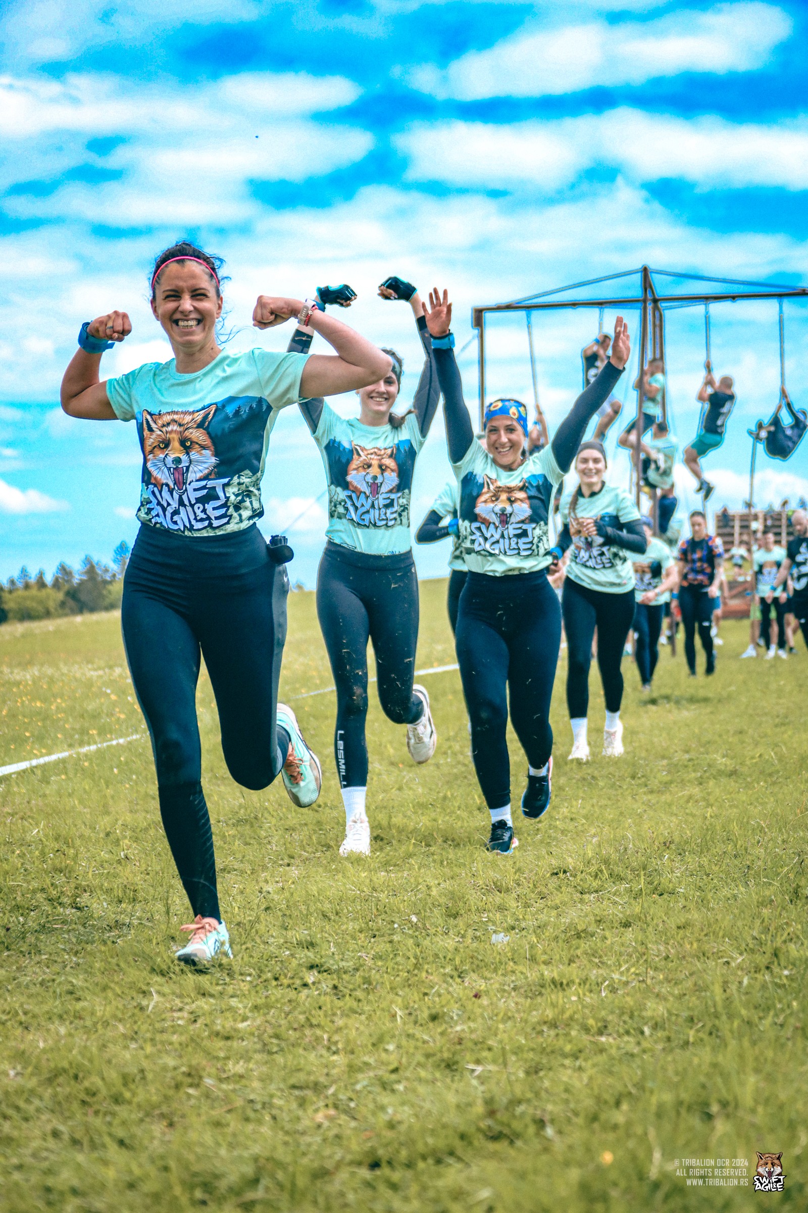
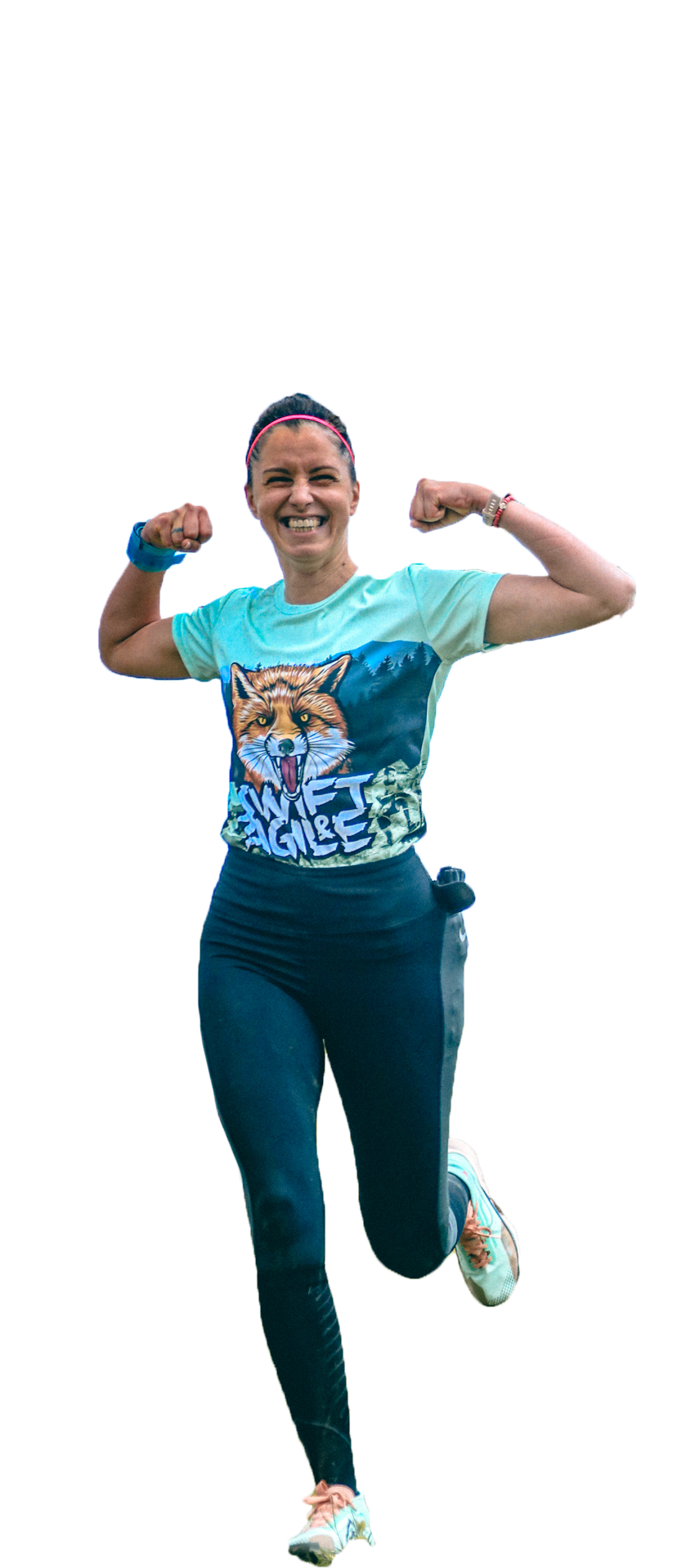
DARE TO

Ultra runner
“I BELIEVE I CAN!”
Idea for Creating Ilirikon Brand...Iliry Tribe, History, Mystery, Adventure,
FIRE | AIR | EART | WATER
Defining Identity.
An Updated
Visual Language
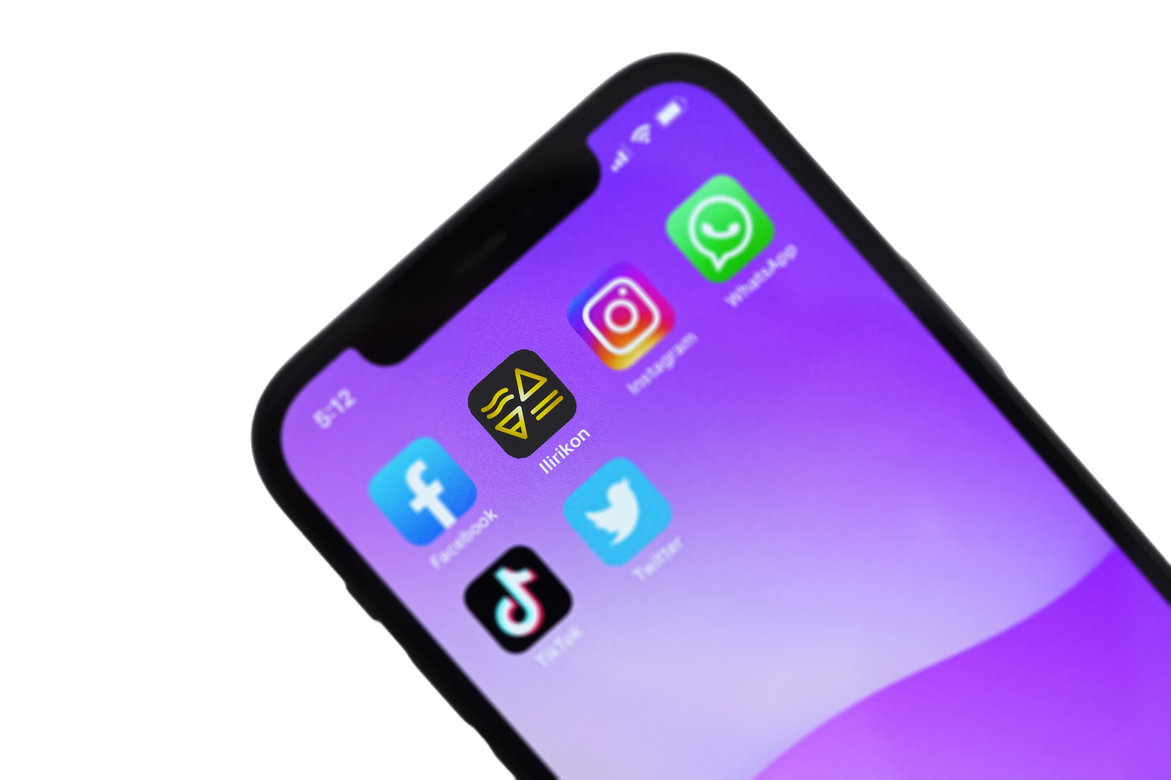


Logo
Essentially, a logo serves as a visual representation of a company, organisation, or brand, making it easily recognisable and memorable.
We began defining the Ilirikon symbol by considering four key elements

Water
Earth
Air
Fire
Exploring Logo
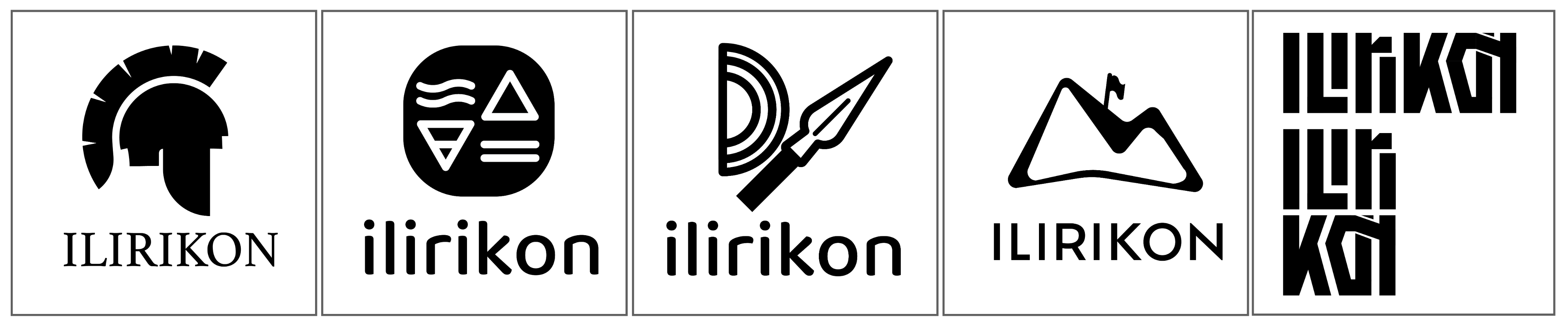
We did a research for the brand imagery by having a series of highly polished logo ideas.
Logo System
We began defining the Ilirikon symbol by considering four key elements
Pozitiv


Negativ


Logo System
We have build the logo system and the typographic scale for a more unified design language.


Logo Full
Logo Letters
Logtip


Icon Construction
Logo Font


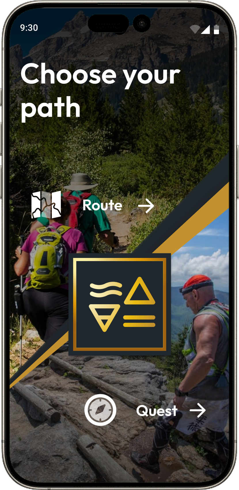
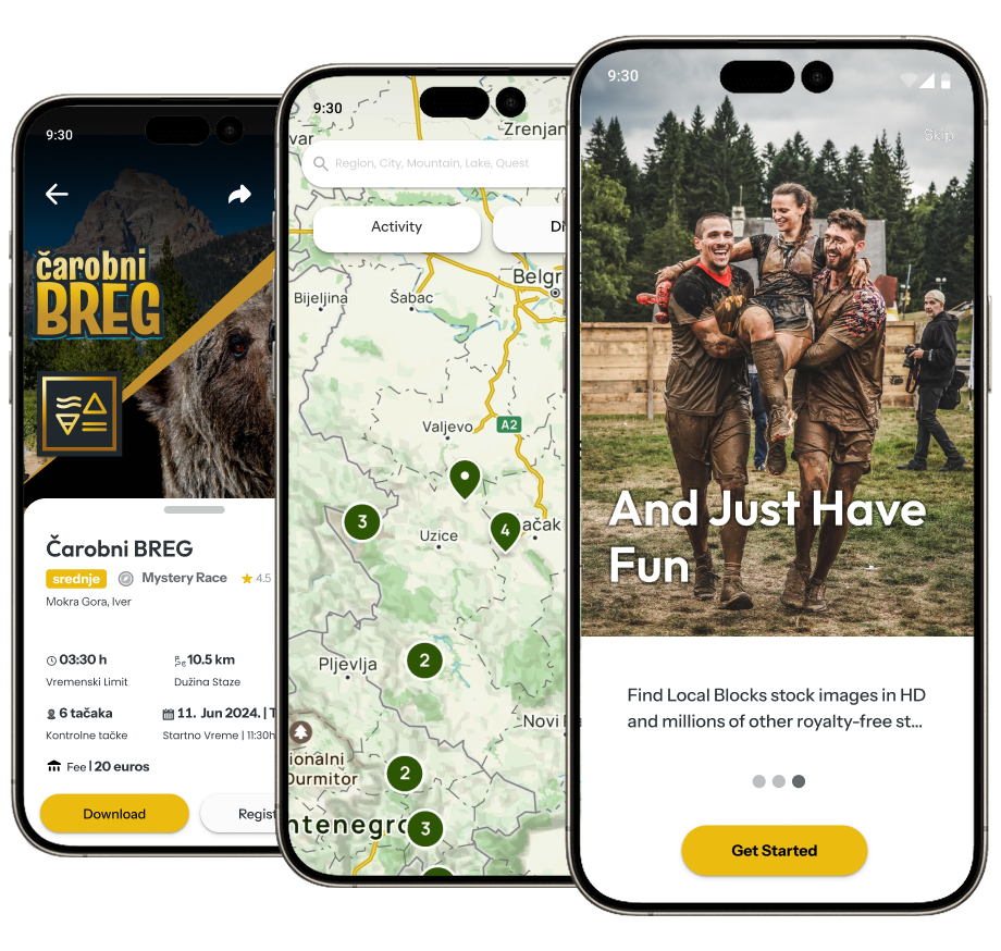
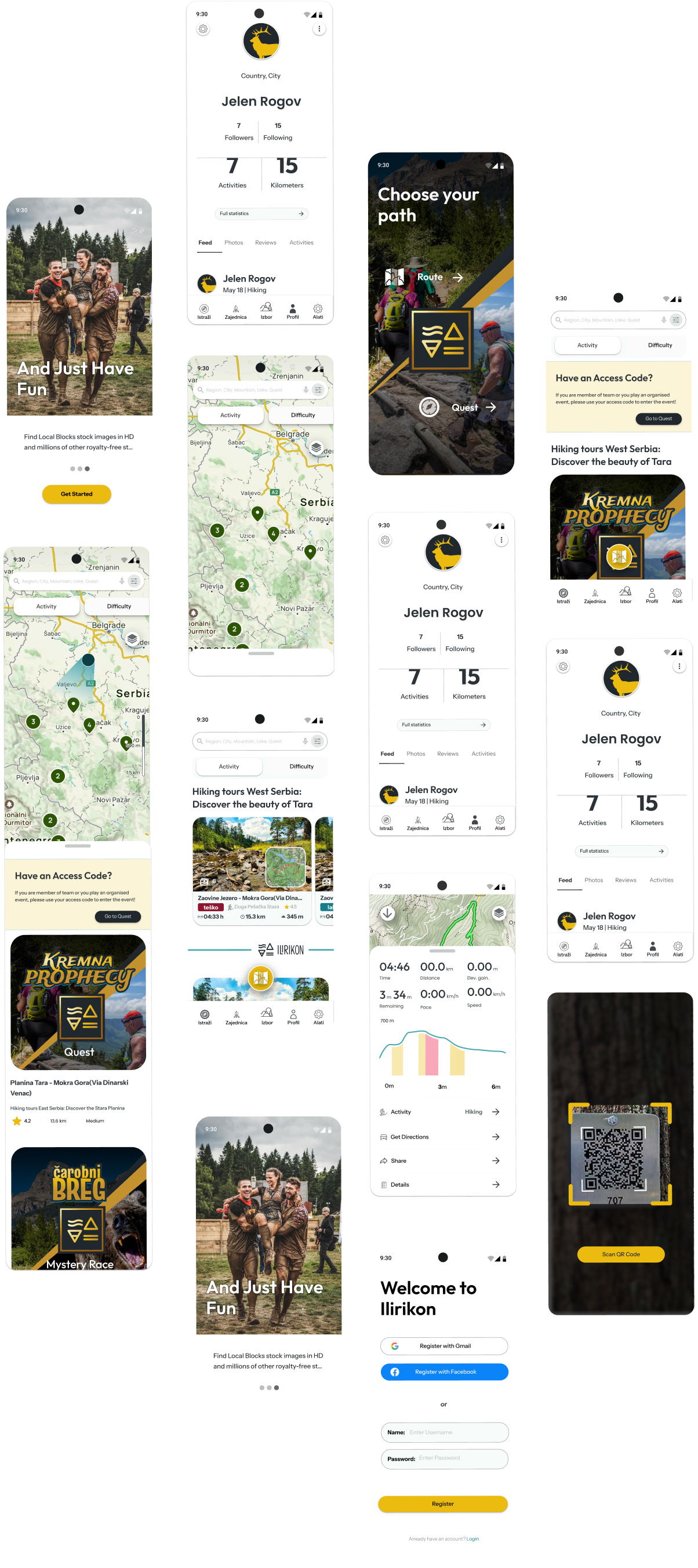
Mobile App
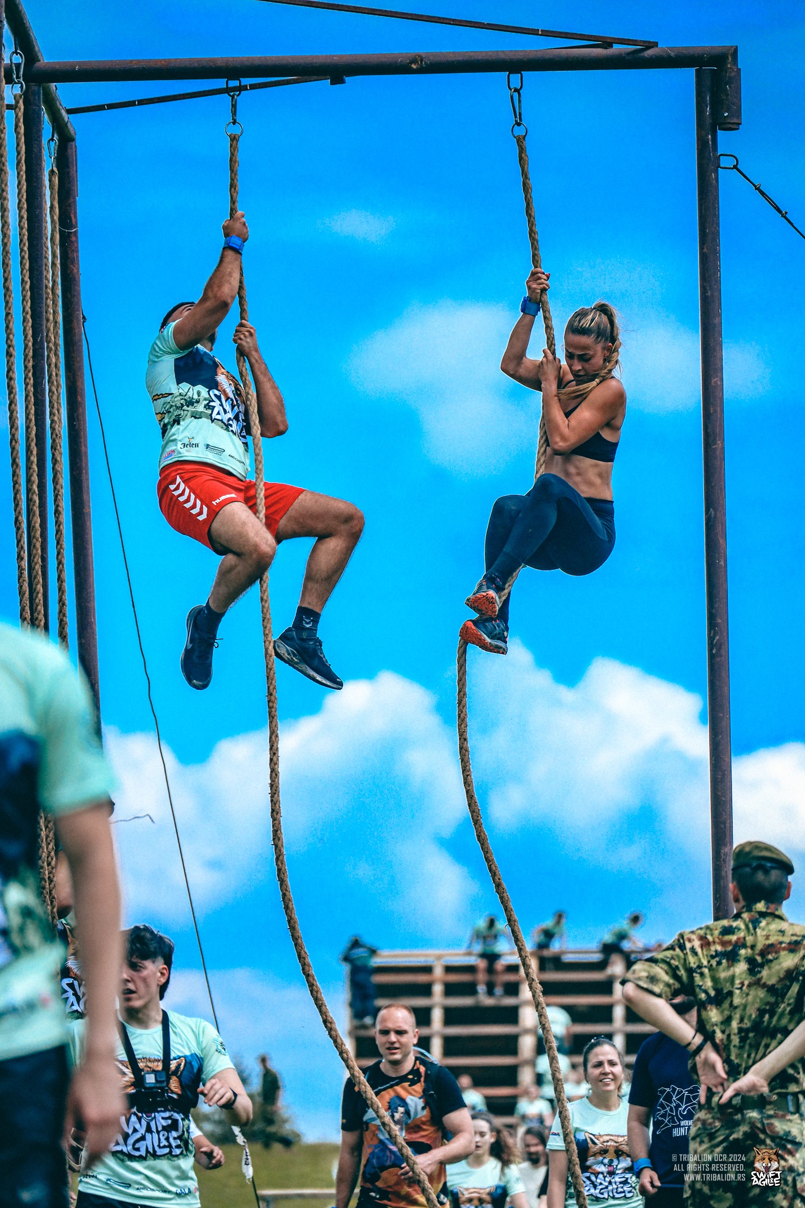
Ilirikon — Gamifying the Great OutdoorsIlirikon is a performance-driven adventure platform designed to transform hiking and nature exploration into an immersive "Quest" experience. My role was to design a digital ecosystem that bridges the gap between high-intensity physical activity and real-time digital rewards, focusing on GPS-tracked routes, competitive leaderboards, and physical-to-digital synergy.
EARTH | AIR | FIRE | WATER
Mobile App
The business concept involved developing a mobile app that users could utilize during competitions
The Challenge:
Designing for "Disrupted" Environments
The primary UX challenge was designing an interface for users who are physically active, often in high-glare outdoor environments with limited connectivity.
Objective:
How to keep users engaged with the "Quest" without distracting them from the safety and beauty of the trail?
Solution:
High-contrast UI, large touch targets for "on-the-go" interaction, and a clear hierarchy of vital information (GPS coordinates, elevation, and checkpoint status).
Adaptive Race Interfaces
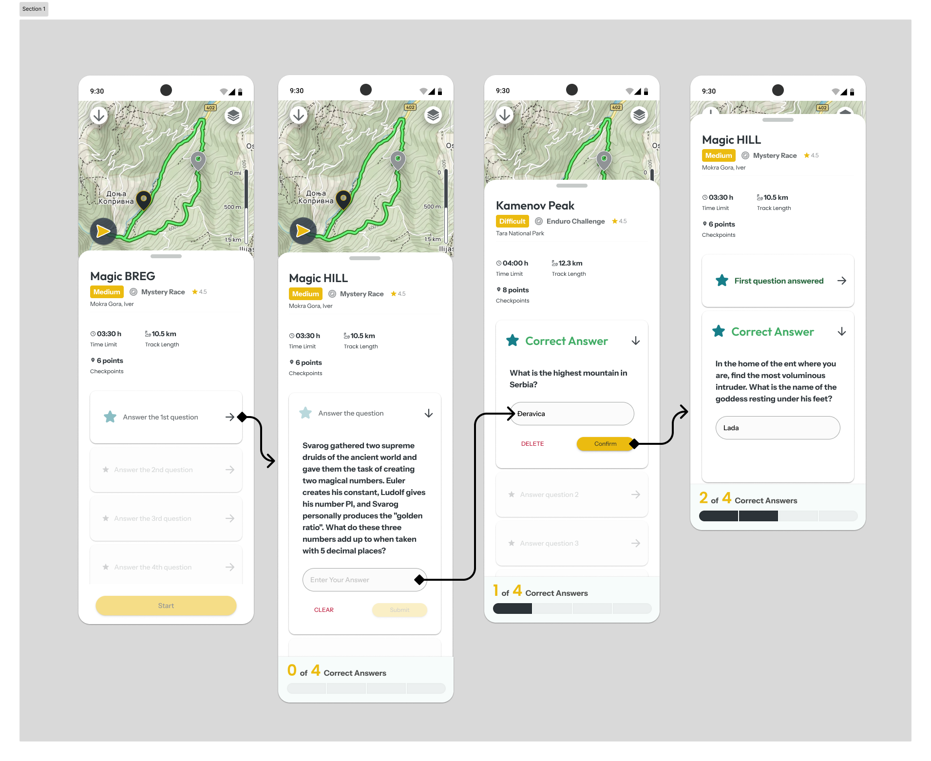
The platform supports multiple modes: Mystery Race, Score Hunt, and Treasure Hunt.
Design Thinking:
I developed a modular UI system where the interface adapts based on the active "Quest" mode—switching from map-centric views to riddle-solving layouts seamlessly.
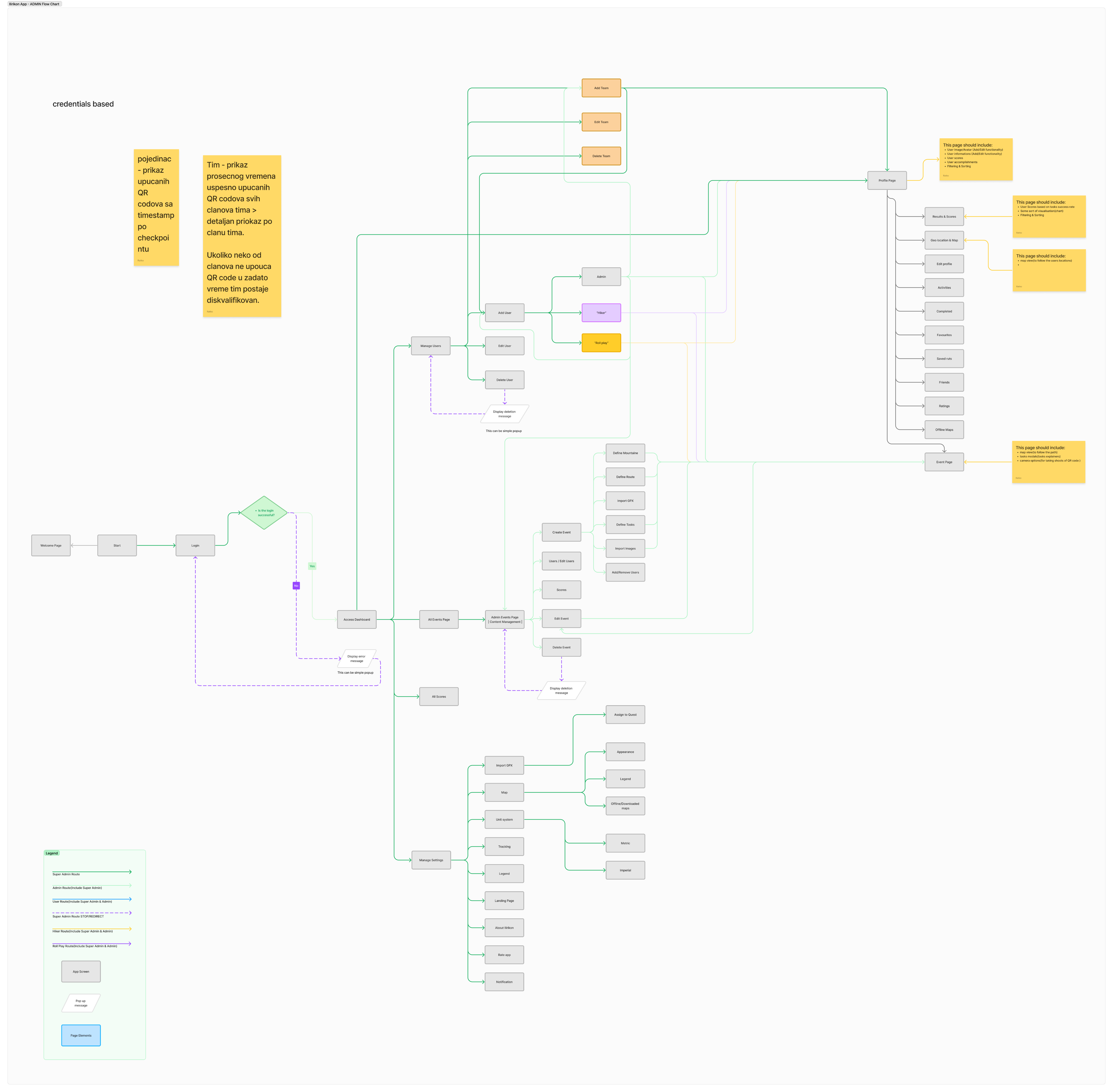
App Mapping & Wireframes
We utilized detailed diagrams and low-fidelity wireframes to illustrate the application flow to stakeholders.
Technical & Product Impact
The platform supports multiple modes: Mystery Race, Score Hunt, and Treasure Hunt.
Mobile-First Scalability:
Built a component library in Figma specifically for the Android/iOS apps, ensuring parity between the marketing landing page and the functional product.
Performance Optimization:
Integrated optimized mapping tiles and "lazy-loading" assets to ensure the app remains functional in low-signal mountain areas.
B2B / Corporate Vertical:
Designed a dedicated flow for corporate team-building events, allowing companies to launch private "Quests" type of events for employee engagement.
The Strategy: The "Eternal" Motivation
The Gamification Engine (The Eternal List)
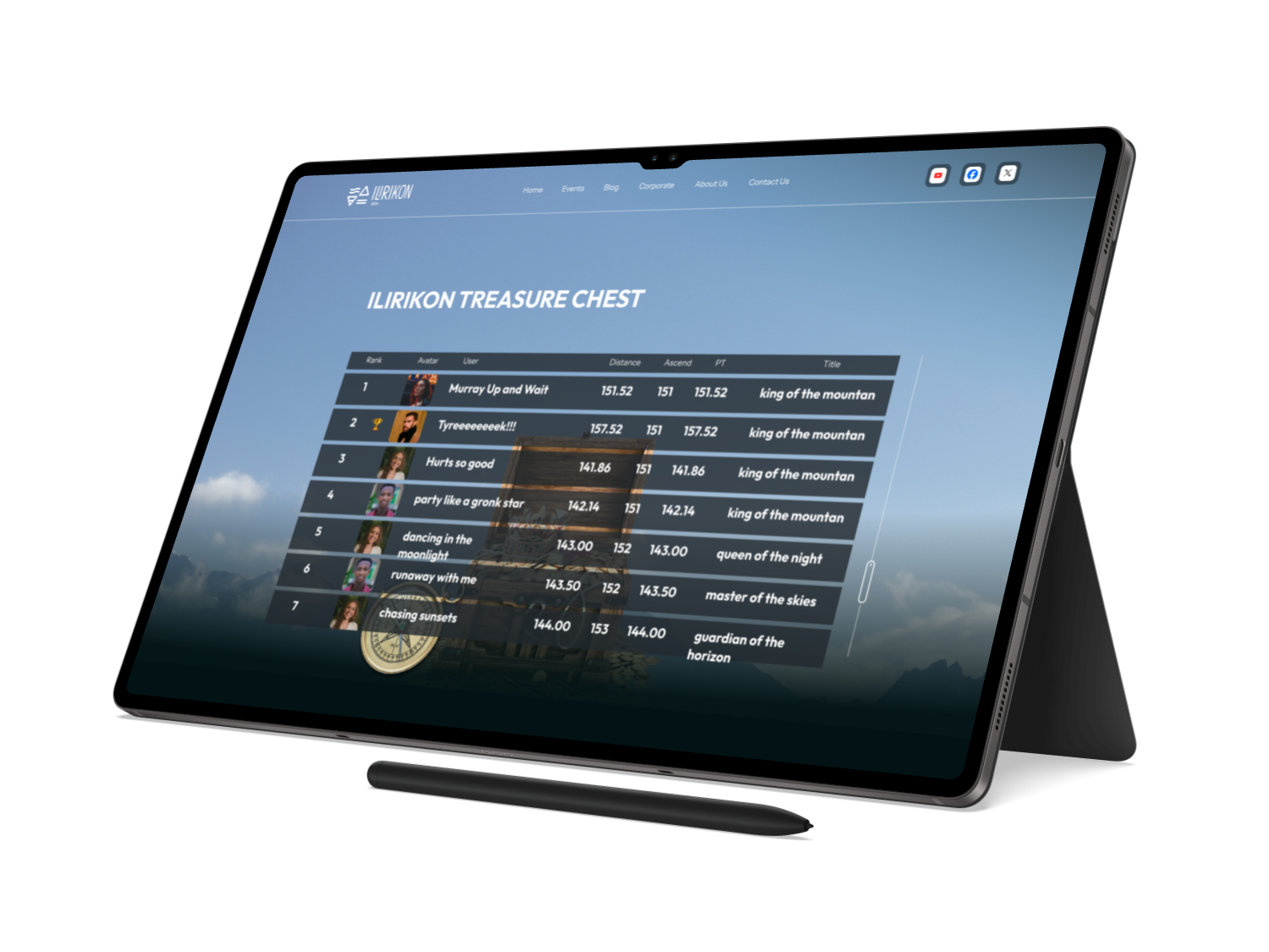
Instead of a standard leaderboard, I designed the "Eternal List"—a hall of fame that tracks cumulative altitude and distance.
SaaS Logic:
Applied retention mechanics common in fitness apps to encourage long-term user "stickiness" and community building.
UX Detail:
Data visualization of personal progress vs. the community, making "Legendary" status feel attainable yet prestigious.
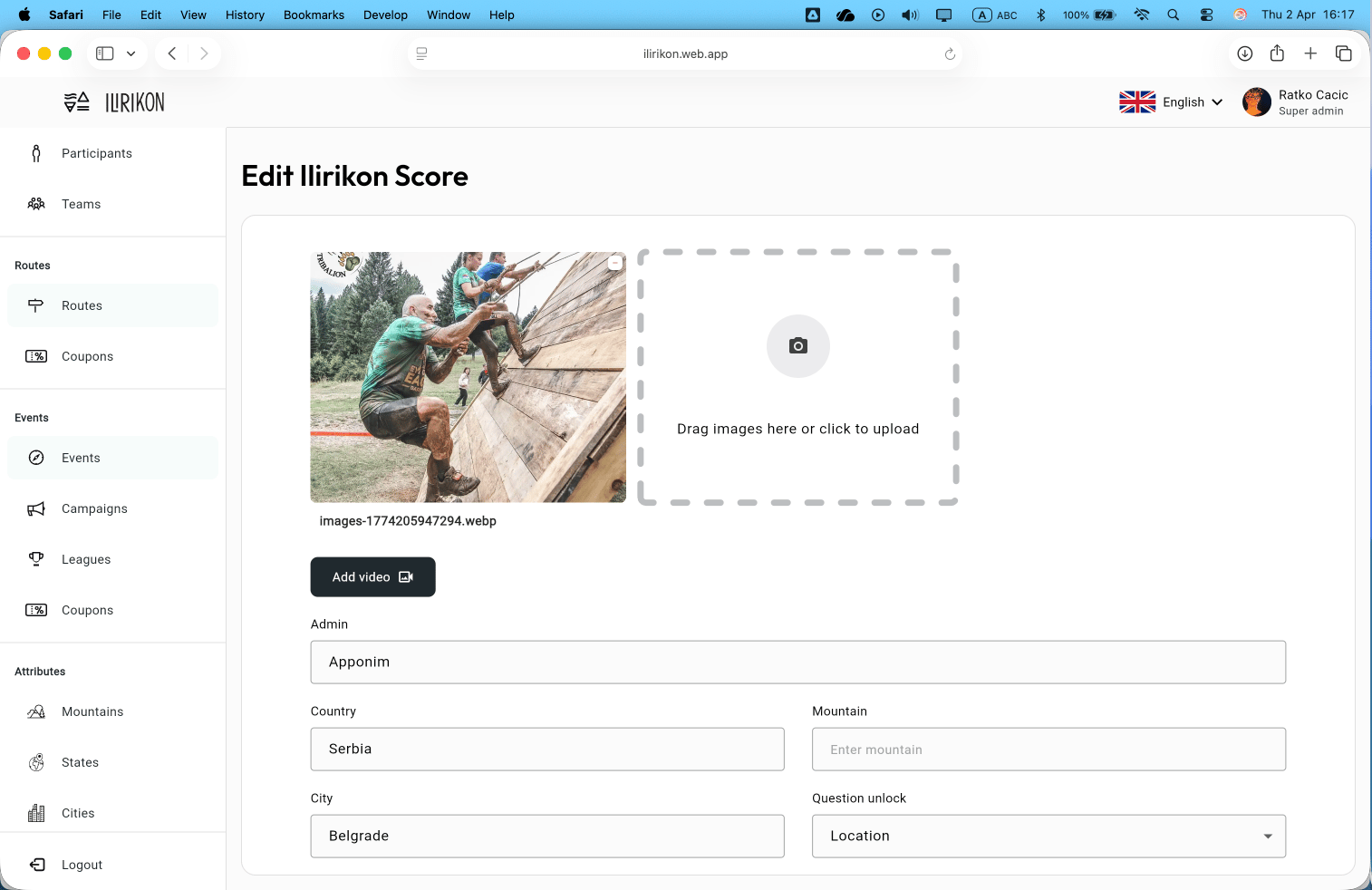
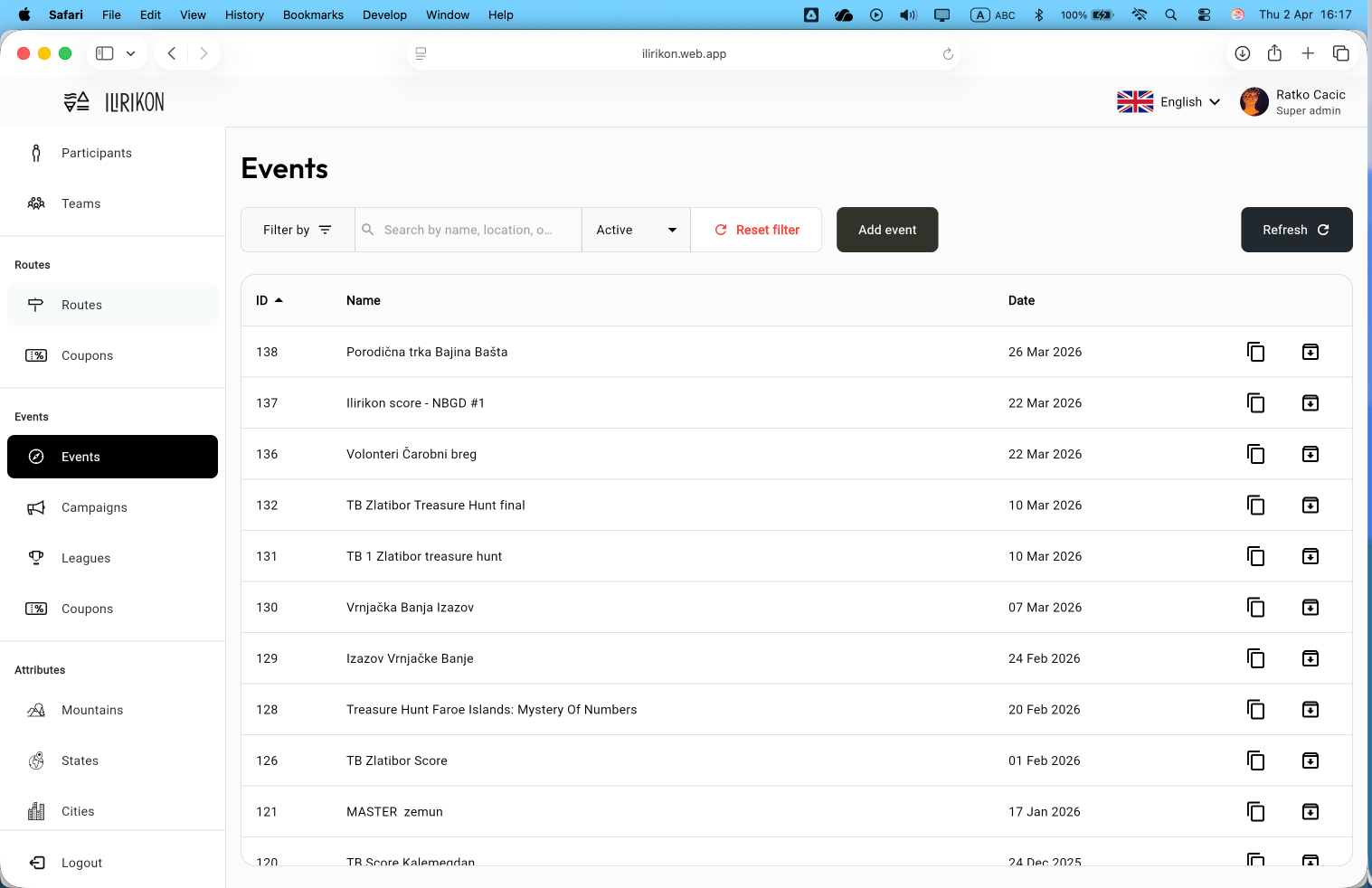
Wab App — Control all eventsIlirikon is a performance-driven adventure platform designed to transform hiking and nature exploration into an immersive "Quest" experience. My role was to design a digital ecosystem that bridges the gap between high-intensity physical activity and real-time digital rewards, focusing on GPS-tracked routes, competitive leaderboards, and physical-to-digital synergy.
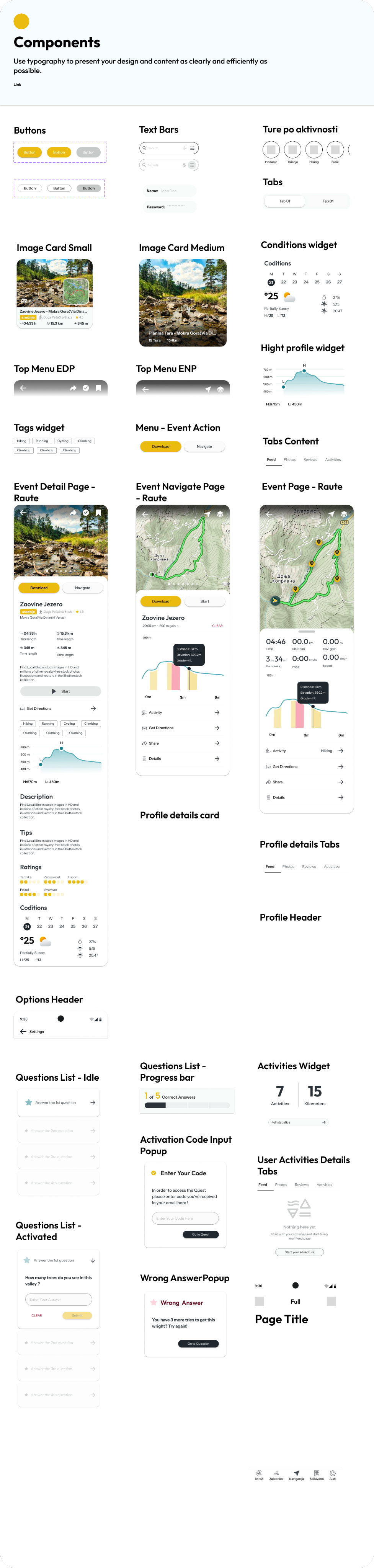
Components library
To ensure consistency and scalability, we built a comprehensive UI component library, streamlining development and enhancing user experience across the application.
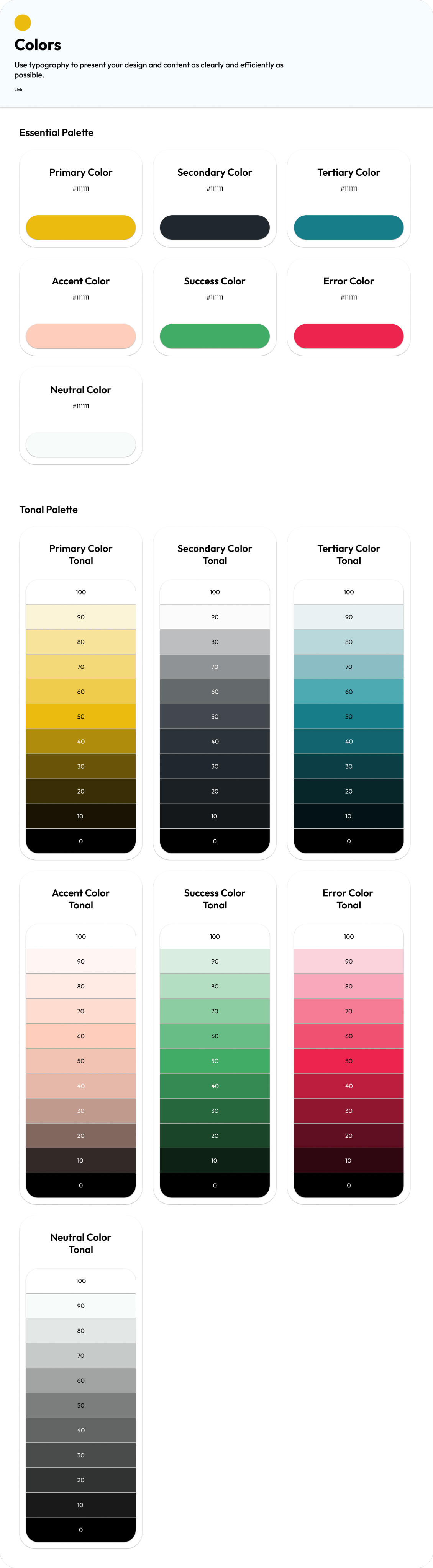
Colors
To ensure consistency and scalability, we developed a comprehensive UI component library, streamlining development and enhancing user experience across the application. The color palette draws inspiration from the Adriatic Sea, incorporating deep blues, vibrant greens, and earthy tones.
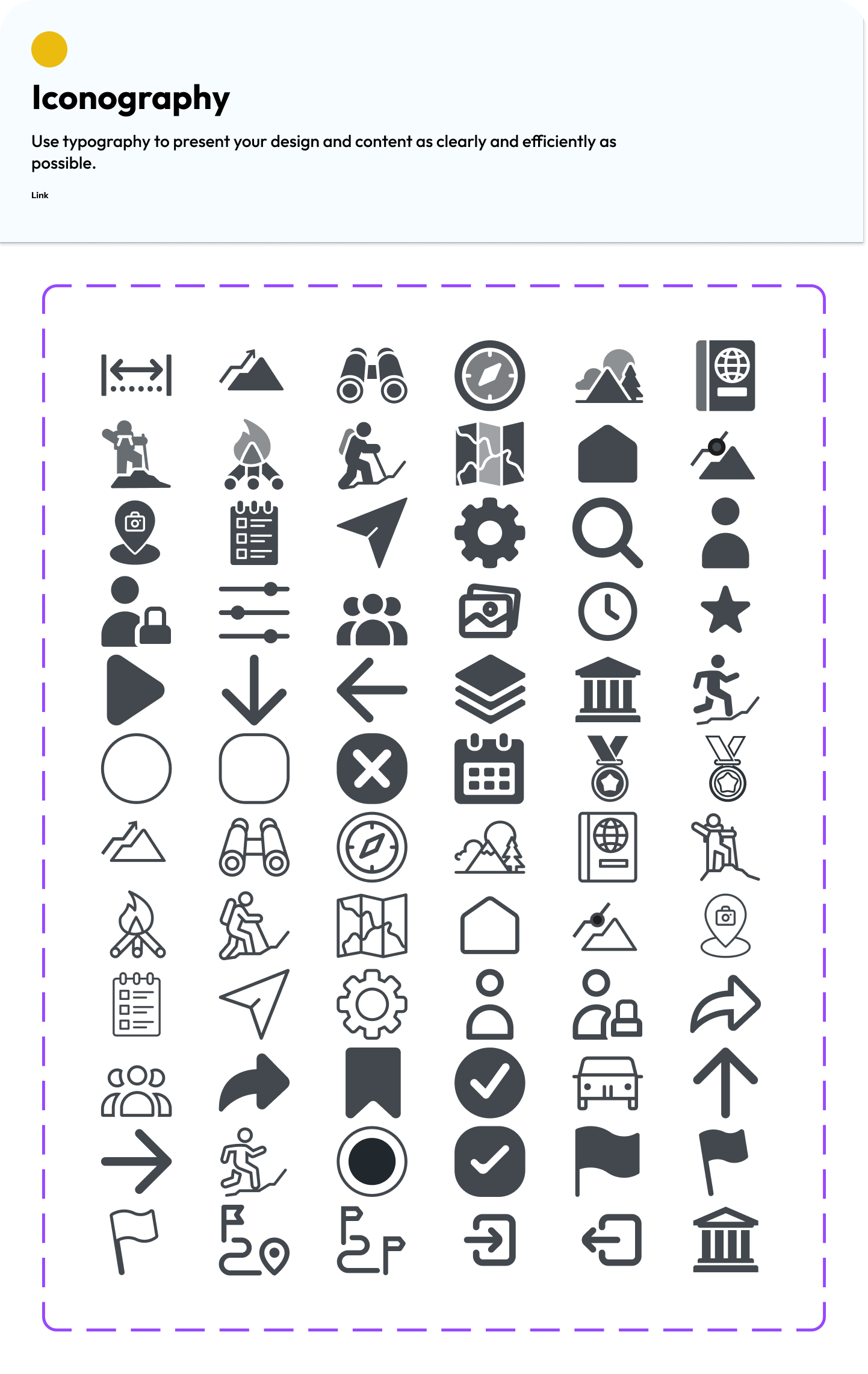
Iconography
We crafted a unique and visually striking set of icons specifically designed for this app, enhancing its overall aesthetic and user experience. Each icon was thoughtfully created to ensure clarity and functionality, making navigation intuitive and engaging for users.
Multi-Channel Cohesion
Digital:
Unified UI components for the website and social media.
Physical:
Standardized signage templates that reduced production costs by 15%.
Collateral:
A brand book that acts as the "Product Documentation" for the business.
Impact & Business Results
Brand Perception:
Post-launch surveys showed a 25% lift in "Premium Quality" perception.
Efficiency:
Reduced time-to-market for new marketing assets by 30% through the use of the brand system templates.
Growth:
Supported a successful expansion into two new regional markets.
Onboarding
Welcome
Created an animations and prototypes to visually demonstrate the onboarding process before actual implementation.
Branding, UI Design
(01)
Coolivery
Branding, Product Design, UX/UI Design
(02)
Ilirikon
Branding, UI Design
(03)
Interventure

Project
Ilirikon App


Brand Design
Brand Design
System Building
Ilirikon faced a fragmentation problem. As a [Brand Category, e.g., Boutique Heritage Brand], their visual identity was inconsistent across digital platforms, print, and physical signage. This lack of cohesion was diluting brand equity and causing confusion during the customer acquisition phase. They needed a scalable brand system that could grow with their product offerings while maintaining a premium, high-trust aesthetic.
Deliverables

001
Logo System
Primary Logo, spacing, co-branding
002
Typographic System
Type library and scale
003
Mobile Application
Buttons, labels, forms etc.
004
Design System
Buttons, labels, forms etc.
005
Brand Application & Business Impact
Consolidating all design elements into one style guide
Starting Point...
Ilirikon required a bridge between traditional heritage and modern digital expectations. The existing identity lacked the scalability needed for a multi-channel rollout across digital platforms and physical environments.
The Challenge:
Research & Discovery
The primary UX challenge was designing an interface for users who are physically active, often in high-glare outdoor environments with limited connectivity.
Competitor Audit:
Analyzed 5 competitors to identify a "white space" in the market—moving away from generic modernism toward "Modern Heritage."
User Personas:
High-contrast UI, large touch targets for "on-the-go" interaction, and a clear hierarchy of vital information (GPS coordinates, elevation, and checkpoint status).
Audit of Touchpoints:
Identified that the most critical drop-off occurred when users moved from digital social ads to the unpolished physical menu/signage.
DARETO
Ultra runner
“I BELIEVE I CAN!”
Idea for Creating Ilirikon Brand...Iliry Tribe, History, Mystery, Adventure,
EARTH | AIR | FIRE | WATER
Defining Identity.
An Updated
Visual Language
Logo
Essentially, a logo serves as a visual representation of a company, organisation, or brand, making it easily recognisable and memorable.
We began defining the Ilirikon symbol by considering four key elements

Water
Earth
Air
Fire
Exploring Logo
We did a research for the brand imagery by having a series of highly polished logo ideas.
Logo System
We began defining the Ilirikon symbol by considering four key elements
Pozitiv

Negativ
Logo System
We have build the logo system and the typographic scale for a more unified design language.


Logo Full
Logo Letters
Logtip
Icon Construction
Logo Font


Mobile App
Ilirikon — Gamifying the Great OutdoorsIlirikon is a performance-driven adventure platform designed to transform hiking and nature exploration into an immersive "Quest" experience. My role was to design a digital ecosystem that bridges the gap between high-intensity physical activity and real-time digital rewards, focusing on GPS-tracked routes, competitive leaderboards, and physical-to-digital synergy.
EARTH | AIR | FIRE | WATER
Mobile App
The business concept involved developing a mobile app that users could utilize during competitions
The Challenge:
Designing for "Disrupted" Environments
The primary UX challenge was designing an interface for users who are physically active, often in high-glare outdoor environments with limited connectivity.
Objective:
How to keep users engaged with the "Quest" without distracting them from the safety and beauty of the trail?
Solution:
High-contrast UI, large touch targets for "on-the-go" interaction, and a clear hierarchy of vital information (GPS coordinates, elevation, and checkpoint status).
Adaptive Race Interfaces
The platform supports multiple modes: Mystery Race, Score Hunt, and Treasure Hunt.
Design Thinking:
I developed a modular UI system where the interface adapts based on the active "Quest" mode—switching from map-centric views to riddle-solving layouts seamlessly.
App Mapping & Wireframes
We utilized detailed diagrams and low-fidelity wireframes to illustrate the application flow to stakeholders.
Technical & Product Impact
The platform supports multiple modes: Mystery Race, Score Hunt, and Treasure Hunt.
Mobile-First Scalability:
Built a component library in Figma specifically for the Android/iOS apps, ensuring parity between the marketing landing page and the functional product.
Performance Optimization:
Integrated optimized mapping tiles and "lazy-loading" assets to ensure the app remains functional in low-signal mountain areas.
B2B / Corporate Vertical:
Designed a dedicated flow for corporate team-building events, allowing companies to launch private "Quests" type of events for employee engagement.
The Strategy: The "Eternal" Motivation
The Gamification Engine (The Eternal List)
Instead of a standard leaderboard, I designed the "Eternal List"—a hall of fame that tracks cumulative altitude and distance.
SaaS Logic:
Applied retention mechanics common in fitness apps to encourage long-term user "stickiness" and community building.
UX Detail:
Data visualization of personal progress vs. the community, making "Legendary" status feel attainable yet prestigious.
Wab App — Control all eventsIlirikon is a performance-driven adventure platform designed to transform hiking and nature exploration into an immersive "Quest" experience. My role was to design a digital ecosystem that bridges the gap between high-intensity physical activity and real-time digital rewards, focusing on GPS-tracked routes, competitive leaderboards, and physical-to-digital synergy.
Components library
To ensure consistency and scalability, we built a comprehensive UI component library, streamlining development and enhancing user experience across the application.
Colors
To ensure consistency and scalability, we developed a comprehensive UI component library, streamlining development and enhancing user experience across the application. The color palette draws inspiration from the Adriatic Sea, incorporating deep blues, vibrant greens, and earthy tones.
Iconography
We crafted a unique and visually striking set of icons specifically designed for this app, enhancing its overall aesthetic and user experience. Each icon was thoughtfully created to ensure clarity and functionality, making navigation intuitive and engaging for users.
Multi-Channel Cohesion
Digital:
Unified UI components for the website and social media.
Physical:
Standardized signage templates that reduced production costs by 15%.
Collateral:
A brand book that acts as the "Product Documentation" for the business.
Impact & Business Results
Brand Perception:
Post-launch surveys showed a 25% lift in "Premium Quality" perception.
Efficiency:
Reduced time-to-market for new marketing assets by 30% through the use of the brand system templates.
Growth:
Supported a successful expansion into two new regional markets.
Onboarding
Welcome
Created an animations and prototypes to visually demonstrate the onboarding process before actual implementation.
Branding, UI Design
(01)
Coolivery
Branding, Product Design, UX/UI Design
(02)
Ilirikon
Branding, UI Design
(03)
Interventure


Project
Ilirikon App


Brand Design
Brand Design
System Building
Ilirikon faced a fragmentation problem. As a [Brand Category, e.g., Boutique Heritage Brand], their visual identity was inconsistent across digital platforms, print, and physical signage. This lack of cohesion was diluting brand equity and causing confusion during the customer acquisition phase. They needed a scalable brand system that could grow with their product offerings while maintaining a premium, high-trust aesthetic.
Deliverables
001
Logo System
Primary Logo, spacing, co-branding
002
Typographic System
Type library and scale
003
Mobile Application
Buttons, labels, forms etc.
004
Design System
Buttons, labels, forms etc.
005
Brand Application & Business Impact
Consolidating all design elements into one style guide
Starting Point...
Ilirikon required a bridge between traditional heritage and modern digital expectations. The existing identity lacked the scalability needed for a multi-channel rollout across digital platforms and physical environments.
The Challenge:
Research & Discovery
The primary UX challenge was designing an interface for users who are physically active, often in high-glare outdoor environments with limited connectivity.
Competitor Audit:
Analyzed 5 competitors to identify a "white space" in the market—moving away from generic modernism toward "Modern Heritage."
User Personas:
High-contrast UI, large touch targets for "on-the-go" interaction, and a clear hierarchy of vital information (GPS coordinates, elevation, and checkpoint status).
Audit of Touchpoints:
Identified that the most critical drop-off occurred when users moved from digital social ads to the unpolished physical menu/signage.
DARETO
Ultra runner
“I BELIEVE I CAN!”
Idea for Creating Ilirikon Brand...Iliry Tribe, History, Mystery, Adventure,
EARTH | AIR | FIRE | WATER
Defining Identity.
An Updated
Visual Language


Logo
Essentially, a logo serves as a visual representation of a company, organisation, or brand, making it easily recognisable and memorable.
We began defining the Ilirikon symbol by considering four key elements
Water
Earth
Air
Fire
Exploring Logo
We did a research for the brand imagery by having a series of highly polished logo ideas.
Logo System
We began defining the Ilirikon symbol by considering four key elements
Pozitiv
Negativ
Logo System
We have build the logo system and the typographic scale for a more unified design language.


Logo Full
Logo Letters
Logtip

Icon Construction
Logo Font


Mobile App
Ilirikon — Gamifying the Great OutdoorsIlirikon is a performance-driven adventure platform designed to transform hiking and nature exploration into an immersive "Quest" experience. My role was to design a digital ecosystem that bridges the gap between high-intensity physical activity and real-time digital rewards, focusing on GPS-tracked routes, competitive leaderboards, and physical-to-digital synergy.
EARTH | AIR | FIRE | WATER
Mobile App
The business concept involved developing a mobile app that users could utilize during competitions
The Challenge:
Designing for "Disrupted" Environments
The primary UX challenge was designing an interface for users who are physically active, often in high-glare outdoor environments with limited connectivity.
Objective:
How to keep users engaged with the "Quest" without distracting them from the safety and beauty of the trail?
Solution:
High-contrast UI, large touch targets for "on-the-go" interaction, and a clear hierarchy of vital information (GPS coordinates, elevation, and checkpoint status).
Adaptive Race Interfaces
The platform supports multiple modes: Mystery Race, Score Hunt, and Treasure Hunt.
Design Thinking:
I developed a modular UI system where the interface adapts based on the active "Quest" mode—switching from map-centric views to riddle-solving layouts seamlessly.
App Mapping & Wireframes
We utilized detailed diagrams and low-fidelity wireframes to illustrate the application flow to stakeholders.
Technical & Product Impact
The platform supports multiple modes: Mystery Race, Score Hunt, and Treasure Hunt.
Mobile-First Scalability:
Built a component library in Figma specifically for the Android/iOS apps, ensuring parity between the marketing landing page and the functional product.
Performance Optimization:
Integrated optimized mapping tiles and "lazy-loading" assets to ensure the app remains functional in low-signal mountain areas.
B2B / Corporate Vertical:
Designed a dedicated flow for corporate team-building events, allowing companies to launch private "Quests" type of events for employee engagement.
The Strategy: The "Eternal" Motivation
The Gamification Engine (The Eternal List)
Instead of a standard leaderboard, I designed the "Eternal List"—a hall of fame that tracks cumulative altitude and distance.
SaaS Logic:
Applied retention mechanics common in fitness apps to encourage long-term user "stickiness" and community building.
UX Detail:
Data visualization of personal progress vs. the community, making "Legendary" status feel attainable yet prestigious.
Wab App — Control all eventsIlirikon is a performance-driven adventure platform designed to transform hiking and nature exploration into an immersive "Quest" experience. My role was to design a digital ecosystem that bridges the gap between high-intensity physical activity and real-time digital rewards, focusing on GPS-tracked routes, competitive leaderboards, and physical-to-digital synergy.
Components library
To ensure consistency and scalability, we built a comprehensive UI component library, streamlining development and enhancing user experience across the application.
Colors
The color palette draws inspiration from the Adriatic Sea, incorporating deep blues, vibrant greens, and earthy tones.
Iconography
We crafted a unique and visually striking set of icons specifically designed for this app, enhancing its overall aesthetic and user experience. Each icon was thoughtfully created to ensure clarity and functionality, making navigation intuitive and engaging for users.
Multi-Channel Cohesion
Digital:
Unified UI components for the website and social media.
Physical:
Standardized signage templates that reduced production costs by 15%.
Collateral:
A brand book that acts as the "Product Documentation" for the business.
Impact & Business Results
Brand Perception:
Post-launch surveys showed a 25% lift in "Premium Quality" perception.
Efficiency:
Reduced time-to-market for new marketing assets by 30% through the use of the brand system templates.
Growth:
Supported a successful expansion into two new regional markets.
Onboarding
Welcome
Created an animations and prototypes to visually demonstrate the onboarding process before actual implementation.
Branding, UI Design
(01)
Coolivery
Branding, Product Design, UX/UI Design
(02)
Ilirikon
Branding, UI Design
(03)
Interventure